Apparently it's hoops that have the illusory effect. But I think some of us are too far gone for that. I always thought Donny fans were a bit on the thin side.I’m normally a traditionalist and prefer even stripes but I must admit I quite like this one. I’ve not had one for two or three years so I might just go for it. Am I correct in saying that the thin stripe will make the more rotund of us look slimmer.......no I thought not.

You are using an out of date browser. It may not display this or other websites correctly.
You should upgrade or use an alternative browser.
You should upgrade or use an alternative browser.
Any news on new kits? (Confirmed Reveal Friday 9AM)
- Thread starter impede
- Start date
Norfolk Imp
Vital 1st Team Regular
Yeah the sooner we switch to our colours to sky blue the better mate.
Dump this red and white ****...
I wouldn’t go that far mate
 .... this is a Lincoln City kit by the way, far better than the latest imposter.
  [/QUOTE]
For me, although within the parameters of the design brief incorporating that logo they have done a good job, it's not my cup of tea.
Yes it is relatively uncluttered and functional, but in my opinion the minimalist inclusion of white stripes is a disappointment.
It is far too similar to a generic all red shirt as used by about 15 of the 92 league clubs. As one of only 6 or 7 clubs that historically have used broad red and white stripes we have lost a distinctive feature of our club. Sometimes clubs that play in all red even go so far as to include pinstripe white on their shirt which is basically what we have got. So as others have said it's not an imps shirt and just because we had one similar before (for a short time) doesn't make it an imps shirt. I'm not counting the mid -60s one.
It's all about identity.
I hope the names and numbers are white as we need something to stand out in a Tuesday night gloom.
But after all what's in a kit?
[/QUOTE]I wouldn’t go that far mate
There's got to be a reason why so many people like that addidas kit.
stokeimp
Vital 1st Team Regular
Would be nice to have green again.
Agree - any style, but I've always thought we should have a green version of the home kit, so this would be green with thin white stripes
USA Imp
Vital Squad Member
Saw the shirt and thought okay, not bad at all. Saw the shirt with the shorts/socks and very happy with how the whole ensemble looks. Will be able to see names and numbers on the back, new sponsor logo blends nicely. Would i buy one? If i lived in Lincoln probably but i don't and after buying three of the away shirts two seasons ago just to get the right size i'm going to skip it (unless i make it back some time soon).
DonnyImp
Vital Squad Member
I can tell you from experience that the majority ain't!Apparently it's hoops that have the illusory effect. But I think some of us are too far gone for that. I always thought Donny fans were a bit on the thin side.
Rob the Imp
Vital Football Hero
Personally, I like our shirts to be more red than white, which is partly why i think this works. Don't think the black part was needed in the collar though, two colours is enough.
domski2017
Vital Squad Member
The test for any new shirt modelled on an athlete is an extra large one, worn on an older and less ripped Lincoln City Fan. I for one will not be intending to test this new theory on the general public. Hope everything is good in glorious Ayrshire.I think the shirt is ok, the sponsor logo blends very well, unlike in recent years. It does help to have a player who looks like a male model to display it, though (James Jones). It wouldn't look quite as good on me, perhaps.
Scotimp
Vital Football Legend
No, I'll stick to the less embarrassing sweat shirt, I think. Missing my train journeys to away games, Dom.The test for any new shirt modelled on an athlete is an extra large one, worn on an older and less ripped Lincoln City Fan. I for one will not be intending to test this new theory on the general public. Hope everything is good in glorious Ayrshire.
Scotimp
Vital Football Legend
Tweet from Darren Huckerby:
The question from that photograph: is that the worst away kit of all time in the background (Gillingham)?
The question from that photograph: is that the worst away kit of all time in the background (Gillingham)?
Last edited:
S6Ian
Vital Reserves Team
[/QUOTE]I wouldn’t go that far mate
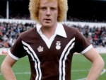
A thing of beauty....
Merthyr Imp
Vital Football Hero
Because of the narrow equal stripes I think for a while we were nicknamed 'the curtain blinds' or something similar.
It was the Window Blinds, said to be due to the resemblance to the striped awnings over shops on the High Street.
But it never caught on like the 'Cits' did.
Scotimp
Vital Football Legend
bristolimp
Vital Champions League
Tweet from Darren Huckerby:
The question from that photograph: is that the worst away kit of all time in the background (Gillingham)?
looks like they have raided the lost property cupboard at 14:55!
sedgleyimp
Vital Champions League
The question from that photograph: is that the worst away kit of all time in the background (Gillingham)?
Not quite
Attachments
Scotimp
Vital Football Legend
Good old Ian Wallace, looks pretty unhappy. I actually think that Gillingham one is worse.Not quite