New Home Shirt | Page 12 | Vital Football

New Home Shirt

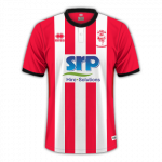
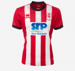
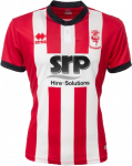
I don’t mind it. While you can’t beat honest, simple, red and white stripes, this isn’t too bad. Couple of nice features. Would prefer having v-neck with/without collar.

(Edit: Only just realised it has a button.)
 
.
Underwhelmed to be honest; much preferred a couple of Graemethexile's well conceived designs. Don't like the button.

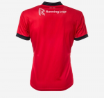
Looks a bit like a red butchers apron. It will certainly not flatter anyone with a bit of a gut; which is possibly why Rheady is yet to model it.

Next year please give the job to Graeme.

That's very kind of you berksimps, but... had I devised this one, it does actually looks quite nice. Apart from the bog suppliers.

lin 19-20-Recovered.png
 
Last edited by a moderator:
That's very kind of you berksimps, but... had I devised this one, it does actually looks quite nice. Apart from the bog suppliers.

In fairness it does look quite nice like that, I guess we needed a side view as well as frontal. Another white stripe down each side would have improved it, and a simple shallow "V" neck collar.

You cannot expect the "Shit Removal People" to change their logo, it is what it is.
 
  • Full guidance, support and assistance offered throughout
Having had the misfortune to use portaloos on more occasions than I care to remember, I must say that there are many people who could use a little "guidance and support" during the urinating process :rofl:
 
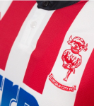
That button at the neck is horrendous. Just like Man City's last season, which looked truly awful. Buttons have no place on football shirts.