You are using an out of date browser. It may not display this or other websites correctly.
You should upgrade or use an alternative browser.
You should upgrade or use an alternative browser.
New Club Badge Released
- Thread starter Nathan_NCFC
- Start date
Forever yellow76
Vital 1st Team Regular
Why mess with the badge? Unless its the same but maybe a better colouring i cant see the point
Nathan_NCFC
Vital Champions League
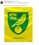
Ha ha ! That's just their current profile picture on Twitter FY76 
 the actual new badge hasnt been released yet, will be released at 6pm apparently !

 the actual new badge hasnt been released yet, will be released at 6pm apparently !
Forever yellow76
Vital 1st Team Regular
I was gonna say Nathan lol!!Ha ha ! That's just their current profile picture on Twitter FY76
the actual new badge hasnt been released yet, will be released at 6pm apparently !
Nathan_NCFC
Vital Champions League
I reckon it will be a similar badge but dumbed down a bit (similar to the Bristol badge maybe), the video sounds like they're expecting a lot of disapproval. I don't see the point though was perfectly fine as it was .... my tattoo is going to be out of date now !
Nathan_NCFC
Vital Champions League
Nathan_NCFC
Vital Champions League
yellow belly
Vital Football Legend
Nothing to get excited about ! It’s almost identical
Nathan_NCFC
Vital Champions League
DRAYTON GREEN
Vital Football Legend
I have been involved with bullshitting design for over 40 years and it never ceases to amaze me how the bullshit still keeps on being dished out.
I asked Miss DG Junior who is expert in Graphics and knows the company who did the work. NCFC should have gone local.
I asked Miss DG Junior who is expert in Graphics and knows the company who did the work. NCFC should have gone local.
Last edited:
DRAYTON GREEN
Vital Football Legend
Its a simple tidy up of image for digital purposes.
No need for the crap that is churned out with it.
No need for the crap that is churned out with it.
Steve from Oz
Vital Football Legend
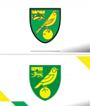
Thanks to Nathan for putting up a clear flattened image of each badge
Neither NCFC nor Oink Un did that so they missed the whole point of assessing the new crest by direct comparison in one spot.
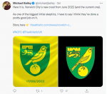
NCFC seems like it coud only put up one blowing in the wind, as per Micheal Baileys one above, also with a different background which only compares apples and oranges.
1} The castle now has its 4 windows which now matches the real thing, though not fenetration location accurate but thats alright as its diagrammatic
2) The lion - we seem to have seceded. All England lions on an image search on google look with their face towards you, proud and defiant. This one is now looking backwards ignoring you, running away, and could be considered to reflect management vision of looking back to League 1 and ignoring the fans, as if it just doesnt want to be there. Even its black outline harness has disappeared. Looking past is not a good image
3) Talking of the black outline, this has now made the whole badge have a more wishy washy appearance, and is not reflecting the bold of the original. The black outline had a meaning and a job to do. Wishy washy - DF era, and as DS has only been here 5 mins this is a DF era badge. Needs re-designing to reflect the current era not the immediate past.
3) The justification for the removal of the black lines was to ensure consistency across all digital, print and physical branding. Mmmmm - since when has consistency been an issue - there are top printer people that could print anything (thinking bank notes), top seamstresses, knitters, crochers, carpet makers that could produce anything mightily accurate for centuries, then we have the digital age, these super computers of massice capabiliites that need a simplified lion castle and canary to achieve consistency. Garbage. Are NCFC trying to simplify England?. It certainly smacks of cheaper production costs reducing three colours to two. Oh whoops - I forgot - its all about self funding isnt it.
4) Norwich City Council Crest badge shape has a pointed bottom so the new one brings that into line, mind you Council need to change ther badge as their bulding looks nothing like the one thats sitting atop the market and looks more European than English, mind you the domes are Argents - ooohh journalists!
5) In summary, its lost its boldness, its lost its cred, its too wishy washy
Its a clear step backwards.
Last edited:
Steve from Oz
Vital Football Legend
This all seems a fait-a-comple.
Again NCFC should have asked the fans for their comments first, they want us to get behind it after all
Again NCFC should have asked the fans for their comments first, they want us to get behind it after all
Forever yellow76
Vital 1st Team Regular
I think its pathetic imo, it looks lazily designed and the club probably paid some design co tens of thousands to produce that shit!
Forever yellow76
Vital 1st Team Regular
I would say the lion is better but thats it and thats not the focal point of the crest. Im all for modernisation if its required, but this wasnt and is worse
DRAYTON GREEN
Vital Football Legend
I think its pathetic imo, it looks lazily designed and the club probably paid some design co tens of thousands to produce that shit!
They went to a top agency who charge very large fees.
They do a lot of football clubs but that is no reason to go to them as all clubs are different so a similar approach is not required.
They should have gone to NCFC supporters who understand the club and not
a big agency who design for themselves.
Forever yellow76
Vital 1st Team Regular
Apparently they consulted 5000 fans?
DRAYTON GREEN
Vital Football Legend
I have been a ST holder and avid fan doing at least 6 aways a season for over 50 years but I have never been consulted.
Canary Kevin
Vital Squad Member
For what my opinion is worth. I am only really bothered about Norwich winning. If thats with a shit badge, then so be it.
DRAYTON GREEN
Vital Football Legend
Totally agree Kev.
However just another example of poor decision making at the top.
However just another example of poor decision making at the top.
