Club crest review | Page 2 | Vital Football

Club crest review

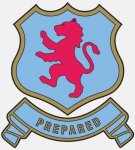
I never liked the one that came in under Lerner and that one was voted on from memory, the lion on it looked more like a cat and I’ve never been keen on that star being incorporated into the badge as that seems finite like we’ll never win it again. Also should say Aston Villa and have a lot more claret in it, we are claret & blue not the other way round. A few years ago the lion was updated to a proper looking lion rampant and it looks a lot better but I’m glad they’re reviewing the whole badge. Not sure how much longer or how many more times the club can keep revisiting the early 80s, time to look forward not back all the time.
 
Great idea to change it. The current one is , let's face it pretty pants. AVFC ?.. I agree we have a unique name and it needs to be shown. That badge is linked with Randy Lerner and I can't stand him and his dereliction of care to my club in the end , so yeah get rid.

Had an adaption/variation of the round badge for my mid life crises tattoo 3 years ago .

Modern version of the round or just the round reboot is fine with me.

Got to be very careful when you say modern. Look at the Bournemouth badge or that attempted Leeds one a few years back . We are founder members of the league and won the European Cup. We should be proud of that and not be ashamed to include the past in an updated badge. Has to have the full club name, large proportion clwret and the lion as well.
 
I'm gutted about this haha. Its gonna be a circle crest aint it. Circles in almost any context always have and always will repulse me.
 
Hmm.
Keenly interested in this,
mainly because I am a designer aka nerd.

I've not cared too much for the two badges during my lifetime,
surely we can do a little bit better.

The one we have now is not so bad in and of itself, it's quite nice and simple but, it doesn't really say Aston Villa to me (aside from the fact that it also literally does not say Aston Villa—would prefer that to 'AVFC').

It's a bit too 'clean' and modern maybe.

I dunno, as said, massive nerd.

I just hope they pick someone good to do it who actually cares.
 
Oh and if they can also make sure that any CLARET used is actually claret and not some kind of pink colour that would be great.
 
Hmm.
Keenly interested in this,
mainly because I am a designer aka nerd.

I've not cared too much for the two badges during my lifetime,
surely we can do a little bit better.

The one we have now is not so bad in and of itself, it's quite nice and simple but, it doesn't really say Aston Villa to me (aside from the fact that it also literally does not say Aston Villa—would prefer that to 'AVFC').

It's a bit too 'clean' and modern maybe.

I dunno, as said, massive nerd.

I just hope they pick someone good to do it who actually cares.

Give it a go yourself, can't be worse than what I've already seen out there.

See if you can get away with drawing a crude penis on the lion.
 
The problem last time is they did an internet survey, and then took the results as gospel, instead of taking that as a starting point for the crest.

The lion has to have claws.

The lion looks like it is juggling at the moment.

We are ASTON VILLA

Look forward to the consultation process and hopefully, the club getting this right.
 
will it be like the consultation process on ST pricing

Do we have major influence over billionaires? No.

Did we take what could have been catastrophic rises and take the edge off them, yes.

Will it be like the consultation on season ticket pricing?

Time will tell.

Do we, as fans, or as fans on a consultation group wield the power? No, mainly because when fans were given the chance to wield the power, they didn't take it.
 
Some of the ST % increases have been catastrophic though if you were in the lowest banding. It is what it is. I get more annoyed by the pretence the club are "consulting" the fans when in reality they do what they want and don't really care about the fans.
 
The problem last time is they did an internet survey, and then took the results as gospel, instead of taking that as a starting point for the crest.

The lion has to have claws.

The lion looks like it is juggling at the moment.

We are ASTON VILLA

Look forward to the consultation process and hopefully, the club getting this right.

If you search Aston Villa lion on Google you’ll get an image of the proper artist version in black and white with all the detail and it looks great imo. The one under Lerner I’d agree was absolutely turd but I think it was overlooked somewhat as it was a decent period for a few seasons, can’t believe it was voted in.